Mobile-first, a solution to the constraints of devices in the early days of mobile computing revolution. Back then it made a lot of sense, and even to this day it works well in a lot of situations. Though what it invariably does do is create two categories of devices—mobile and desktop—which tend to carry a lot of other assumptions:
- Mobiles are touch, desktops are cursor
- Mobiles have slow internet, desktops have fast internet
- Mobile devices are slow, desktop devices are fast
- etc…
And these assumptions start to create a few issues in today's device landscape.
The latest mobile devices are far more powerful than your average laptop or desktop. There are more and more hybrid devices which work with both touch and mouse. Are tablets mobile or desktop? Or are they a new category altogether?
Device capabilities
The device capabilities approach is a type of progressive enhancement where you initially target less capable devices, then enhance at they become more capable. In many ways, that's what mobile-first is attempting to do, just to a lesser effect. Let me explain.
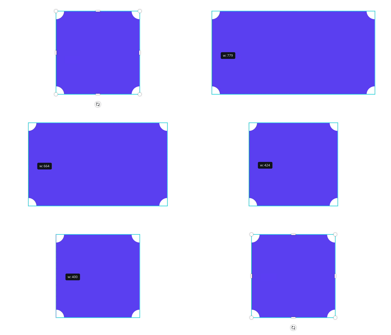
Canva, the product I work on day-to-day, is a pretty complex beast. Not too long ago we were working on the selection frame—the handles which appear when an element is selected.

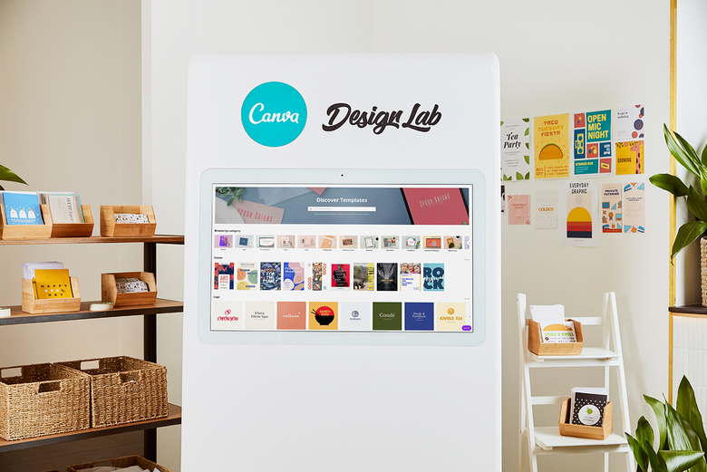
Previously we had a version for desktop and a version for mobile—which made things touch friendly—and that worked pretty nicely for the most part. Though around the same time we were also developing something which turned into the Canva Design Lab.
By most measures it's a desktop device—it has a large 40" screen, it's connected to WiFi, and it sits in one spot—and yet, the screen is touch enabled. The categorisation meant that the large touchscreen was using the desktop version of the selection frame, a version which had been optimised for use with a mouse.
We were targeting "mobile or desktop", when instead we should have been targeting a particular capability of the device. In this particular case that would have been the pointer, which essentially maps to touch or mouse.
That's a pretty extreme example, but there are plenty more situations where you'll encounter similar issues. Below are some interactive examples and practical solutions to dealing with these issues.
Viewport
Size of the viewport is most frequently considered when designing mobile-first. The most commonly targeted attribute is viewport width, with other attributes including height, aspect ratio, and device orientation i.e. portrait and landscape.
The first thing of note is that the viewport doesn't necessarily equal the screen size. It occasionally does, but in most cases UI is taking up space, the window isn't using the entire screen or some other reason like safe areas. Take your current situation:
Try resizing your browser to see how that impacts the values.
A common way to design for different size devices is to use breakpoints. The mistake most make with breakpoints though is placing them at points which exactly match common device sizes (375px, 768px, 1024px, etc).
This becomes a bit of a maintenance nightmare when September rolls around and Apple decides to release a new iPad—they currently have 4 different sized iPads on sale.
If we take a step back and look across all the devices on the market today there's pretty apparent clusters around the common device classes—phone, tablet, laptop and desktop. It's in the gaps between the clusters where we should place our breakpoints:
There's a fantastic article by David Gilbertson on The 100% correct way to do CSS breakpoints which covers this topic in depth.
Pointers
Next up is pointers. The typical interpretation is touch vs mouse—it's even reflected in the pointer media query specifications—though the reality is more of a spectrum:
- Wacom
- Mouse
- Trackpad
- Smartphone
- Plane screens
When it comes to pointer accuracy most platforms have suggestions on minimum target sizes, which is a good place to start, though other factors are worth taking into account.
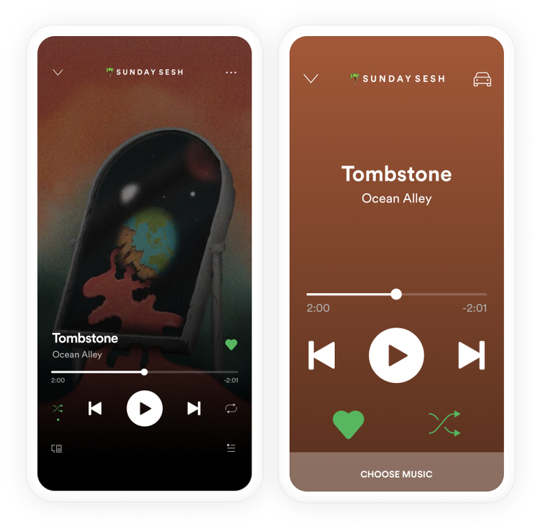
A good example is Car Mode for apps like Spotify and Maps. Even though the device is the same, the context is quite different. A combination of focus being on the road, the device being used further away than is typical, and the general bumps and jumps you get when driving means that it's much harder to accurately tap elements on the screen. To account for this Car Mode increases the size of commonly used actions:
Even the type of screen can be an issue. Capacitive touchscreens used on modern smart phones have far greater accuracy than other types of touchscreen technologies—I'm sure you've all struggled with the screens on planes and ATMs before.
As a little experiment try dragging around the different circles below. You may notice that some take more effort, or are even impossible, to move around on your device:
- 64px
- 48px (Material)
- 44px (HIG)
- 24px
- 8px
Every pointer supports a simple tap or click events, though most support more advanced events—such as right click, double tap, or swipe.
Often the device, specifically the size of the device, is used to detect support for these events. When we say mobile devices are touch we'd be right. But so are a lot of laptops.
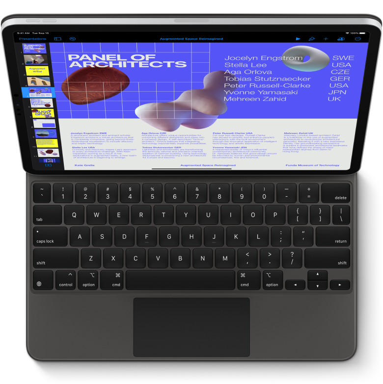
Lots of devices support touch but aren't considered "mobile" devices, and a many more support several different pointer types—the latest iPad update includes first class support for mouses and trackpads.
A far more accurate method is to use one of the various pointer API's, which reveal a lot of information about the current pointer type. Click or tap the button below see what it says about your pointer:
The ideal solution is to design to suit the needs of the "least capable" pointer then, if necessary, progressively enhancing as accuracy and capabilities improve.
It's worth also noting that whilst not all advanced events are available across every device, there's often other events of interactions which can serve as a suitable alternative. A few to keep in mind:
| Use case | Mouse | Touch |
|---|---|---|
| Tertiary actions | Right click | Long press |
| Selection | Double click | Two finger tap |
| Zoom | Dedicated UI | Pinch |
Keyboard
The keyboard only really has two options available: a virtual keyboard or a physical keyboard. Most devices support one or the other, though there's a growing number of devices which support both—though never both at the same time. An iPad, for instance, won't show the virtual keyboard if a Bluetooth or smart keyboard is connected.
Physical keyboards don't pose much of an issue, though virtual keyboards take up valuable screen real estate when they appear. Unfortunately at this time there's no nice way to detect the existence of a virtual keyboard, nor accurately measure the size of the resultant keyboard. There are some hacky solutions—such as detecting changes to the size of the viewport—just keep in mind that any solution is unreliable and should be tested across different devices and platforms.
I did originally mention that there were only two keyboard options, though that's not strictly true. If you want to go down a weird and wonderful rabbit hole here's a good guide on keyboard alternatives.
Devices sensors and hardware
Devices sensors and hardware is where things start to get interesting. They include things like gyroscopes, GPS, haptic engines, cameras, fingerprint sensors, and ambient light sensors.
The usage of these sensors and hardware can range from subtle enhancements for the user, such as a small buzz of feedback from a haptic engine, right through to opening up entire product categories in the case of GPS.
There's lots of different API's which can access these sensors and hardware from within the browser. One you've likely come across is the Geolocation API which can be used to locate your current position. The API supports much more than just position though, click or tap the button below to find out more:
Unfortunately, support for many of these API's isn't great across the various platforms and browsers, so proceed with caution. Most are in active development so it's worth keeping up to date with the available browser API's for more interesting and upcoming options such as haptic feedback and ambient light sensors.
Network speeds
Network speed isn't necessarily a device constraint, but it can greatly impact how they're used. There's different ways of detecting network speeds with varying levels of accuracy.
The simplest check is to see if you're online at all. The Navigator.onLine API returns a boolean checking whether you're connected to a network or not.
It's possible to detect speed by getting the browser to fetch media of a known size then measuring the elapsed time. There's also an experimental Network Information API which provides even further detail for things such as connection type.
Sadly neither of these approaches is particularly accurate or widely supported so the best approach is to take the stance that network speeds can be slow and unreliable. So only send as much as necessary and always compress files and assets.
It's also worth clarifying that a mobile connection doesn't assure slow speeds, just as a wired or WiFi connection doesn't assure fast speeds. The relative speed difference between Wifi and mobile connections varies drastically around the world:
- China
- Russia
- Singapore
- South Korea
- UK
- USA
- Belgium
- Brazil
- Finland
- Hungary
- Norway
- New Zealand
- Australia
- Egypt
- Greece
- South Africa
- Turkey
- Qatar
There's also more situational factors which can impact speeds—I'm sure you've all used a flaky WiFi connection at an airport or cafe before.
And so on…
The intent of mobile-first is the right one. And for your average site or app, the outcome between a mobile-first approach vs a device capability approach is fairly much the same.
Though as the device landscape continues to converge, the categorisations will continue to blur. And as you introduce more interactivity and complex features to your site, the singular approach starts to break down.
It's only a slight mindset shift between the two approaches, but it is a significant one. Design for a touchscreen and it'll work with a mouse, optimise performance for a slow connection and it'll work on a faster connection, design for a small screen, and at the very least it'll work on a larger screen.
Since we started this approach at Canva it's meant less code, less design, and less testing—all for a far greater outcome. And that's something I think we can all get behind.


